


<!--
Work info
-->
Personal Project
Product Designer

<!--
Overview
-->
Wallep reimagines personal finance for a generation that finds money stressful. Instead of showing Gen Z users more numbers, it uses behavioral nudges and a single 0–100 financial score to turn saving into small, confident wins. Over an 8-week project I owned the end-to-end design — research, competitive analysis, user interviews, user flows, UI, and the visual system.
<!--
01 — The Problem
-->
Gen Z is financially anxious — and current apps make it worse.
Existing banking apps overwhelm users with raw transaction data, offer no clear spending categories, and bury savings tools behind unnecessary features. The result? Users avoid their finances entirely.
of Gen Z users face financial challenges when trying to reach big savings goals.
<!--
02 — Competitive Analysis
-->
Existing apps like Mint and Venmo focus on transaction history, not behavioral change. I mapped their strengths and gaps to find where Wallep could stand out.

Chase
shows you your current balance and recent payments, but lacks motivation to save.

Rocket Money
Shows your spending and budget, but lacks setting financial goals.

Robinhood
Shows your investment in the long term, but causes financial anxiety.
<!--
03 — What Users Told Me
-->
Direct quotes from user interviews that shaped the design direction.
"The app has too many numbers. It makes me feel overwhelmed, so I close it quickly."
"I know I need to save, but the app never tells me when to save or how much."
"Saving for a simple thing feels too big and impossible."
<!--
04 — The Solution
-->
Shift behavior, not just display data.
Instead of showing users what they already spent, Wallep uses behavioral data to help them grow financially — through nudges, clarity, and small wins.
Smart Move
Learns spending patterns to find the perfect time and amount to save automatically.
Financial Score
Replaces overwhelming balance sheets with a simple 0–100 health score.
Micro-Goals
Breaks intimidating savings targets into small, achievable milestones with rewards.
<!--
05 — Wireframes & User Flows
-->
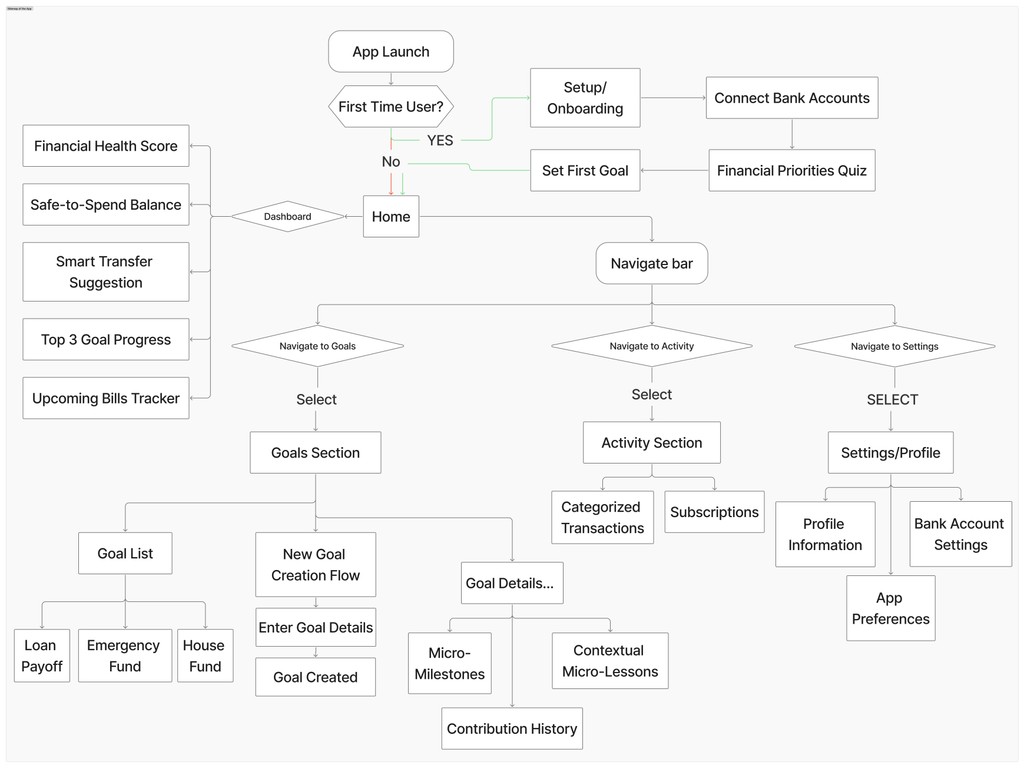
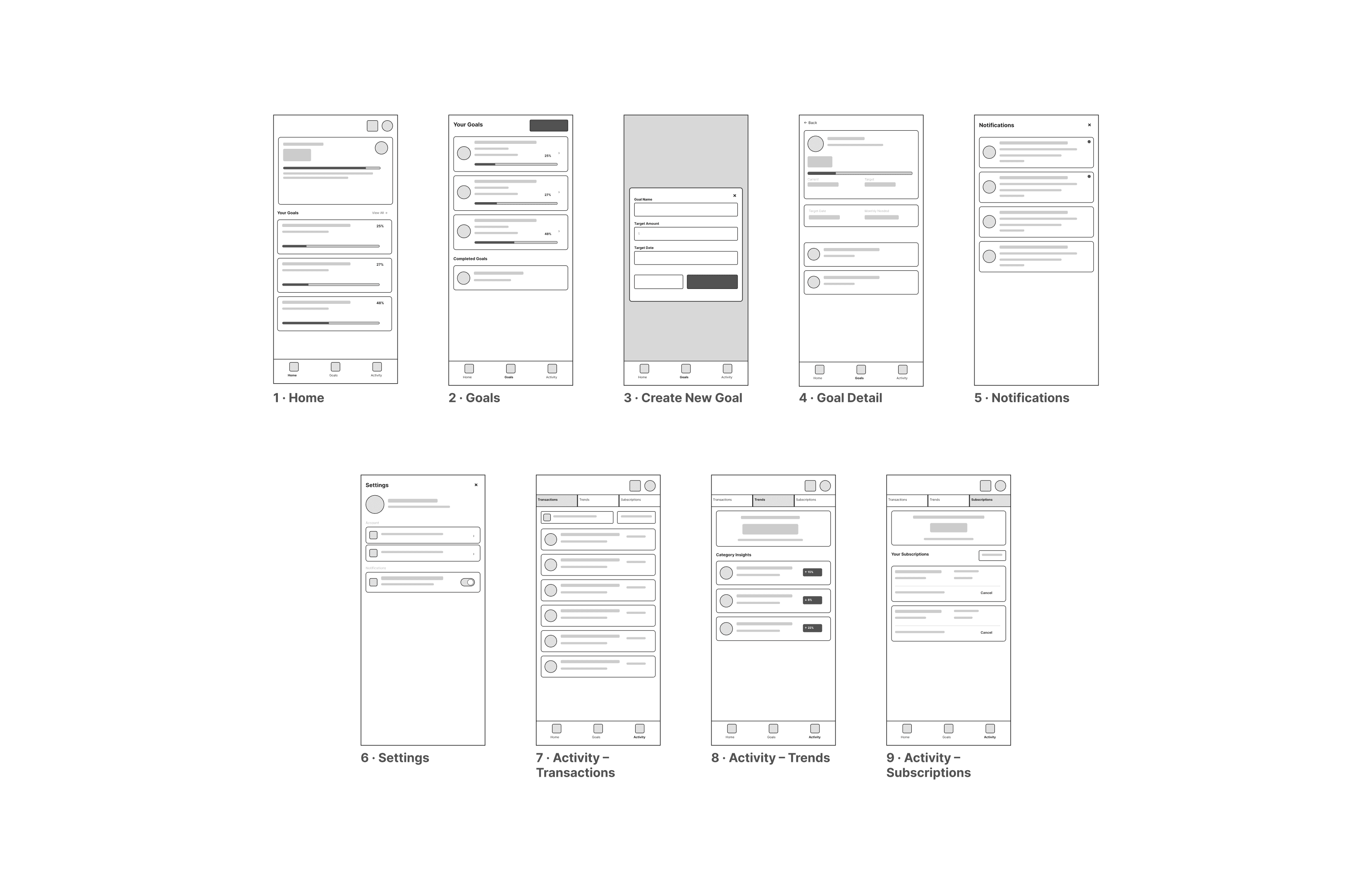
Before jumping into high-fidelity screens, I mapped out every key flow in low-fi wireframes — onboarding, goal creation, savings nudges, and the financial score dashboard.
<!--
06 — Early Iterations
-->
Before
The initial version lacks internal information. Users expressed confusion due to the absence of distinctions from conventional banks.
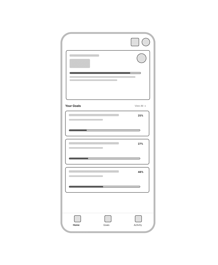
After
Stripped back to essentials. The Financial Score replaced raw numbers, giving users one clear signal of their financial health.

<!--
07 — Visual System
-->
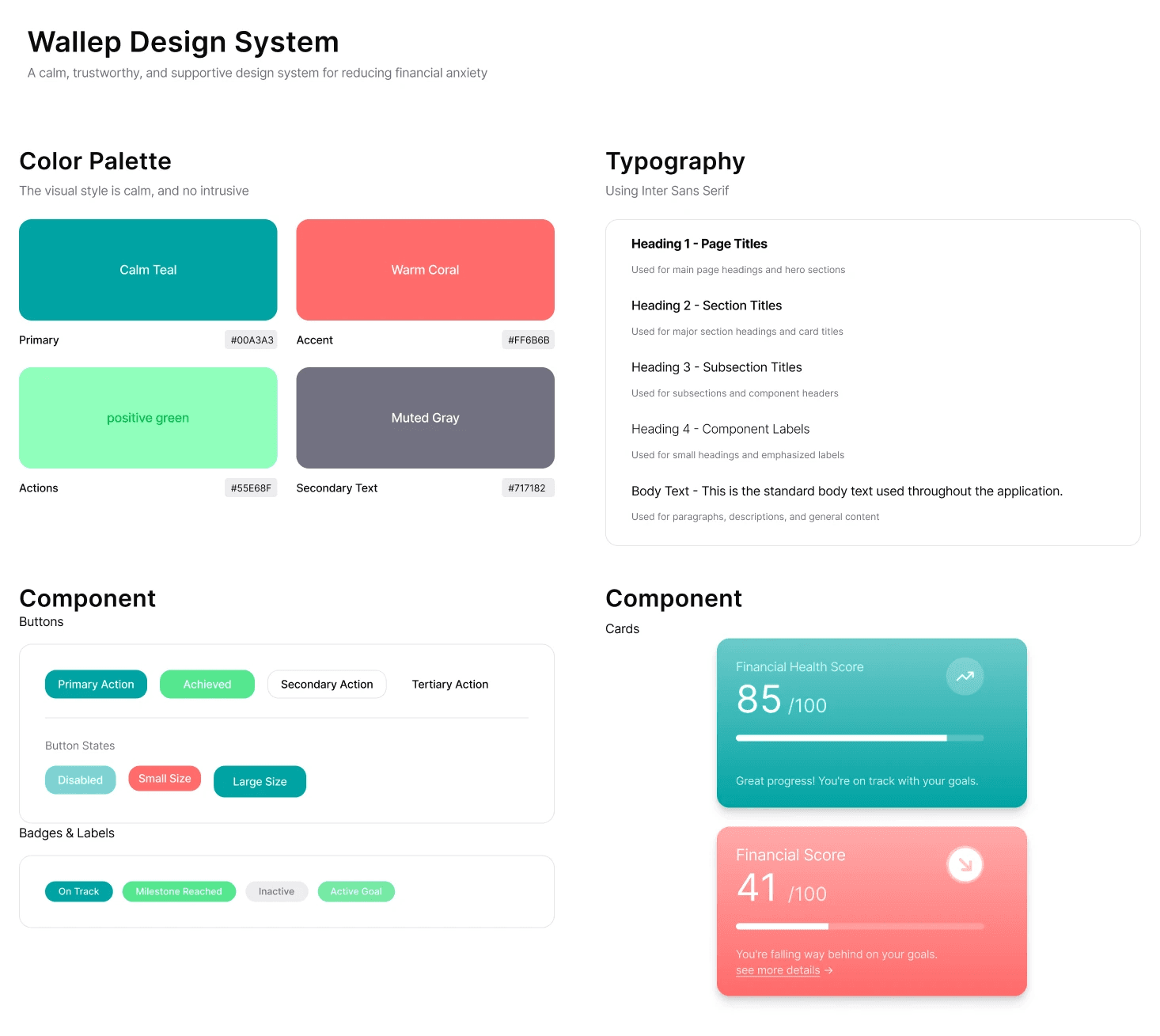
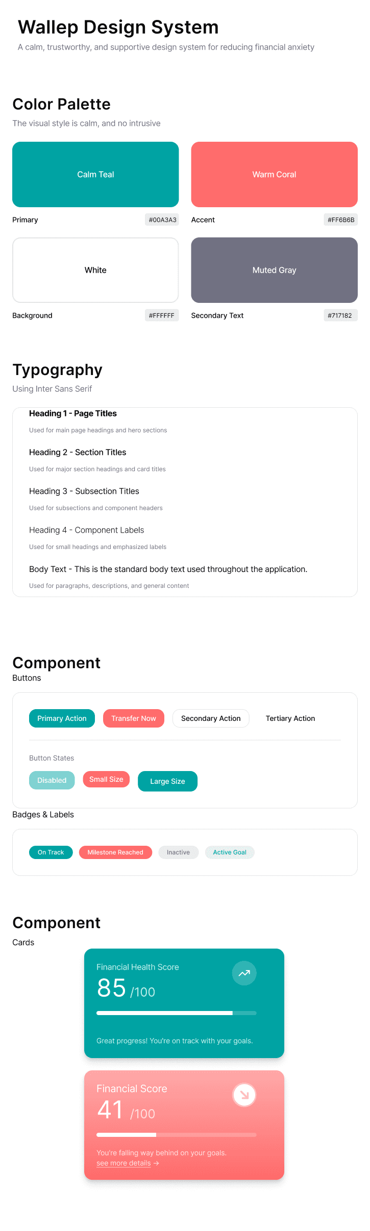
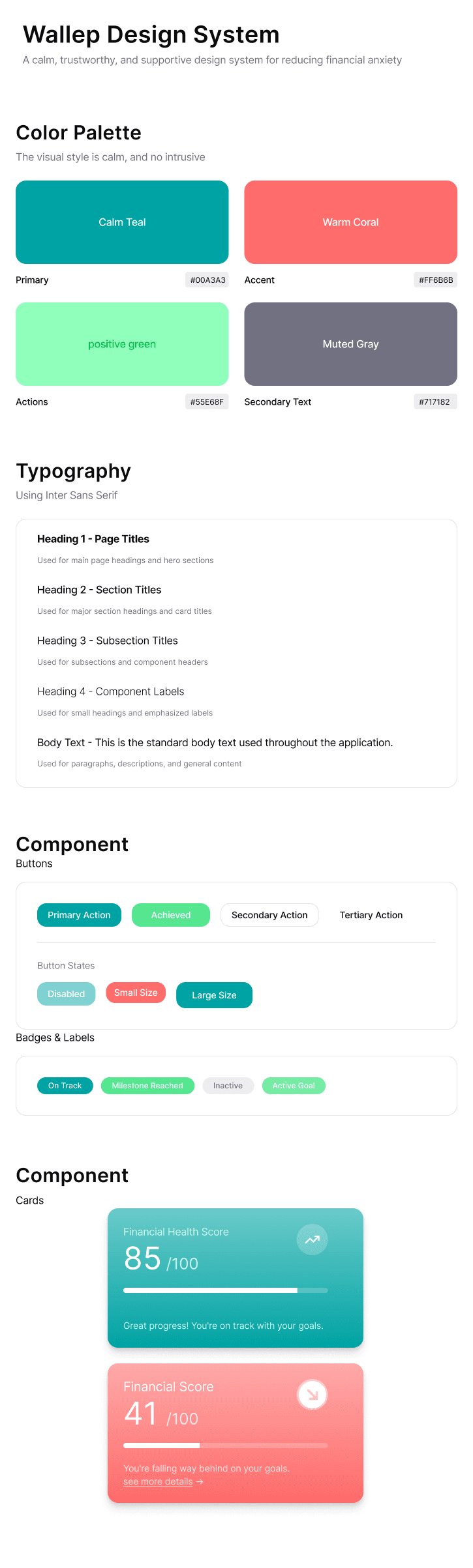
A cohesive design language built around calm colors, rounded shapes, and generous spacing — designed to reduce financial anxiety.
<!--
08 — What I Took Away
-->
Less is more
"Keep the important" means actively hiding features that don't serve the user's primary goal — even when stakeholders want them visible.
The breakthrough
The Financial Score was the key insight: replacing raw numbers with a simple 0–100 score reduced cognitive load and made users feel in control.
Next step
Expanding the Financial Score to include a community page — using social motivation to encourage saving without increasing anxiety.