


<!--
Work info
-->
Personal Project
Project Overview
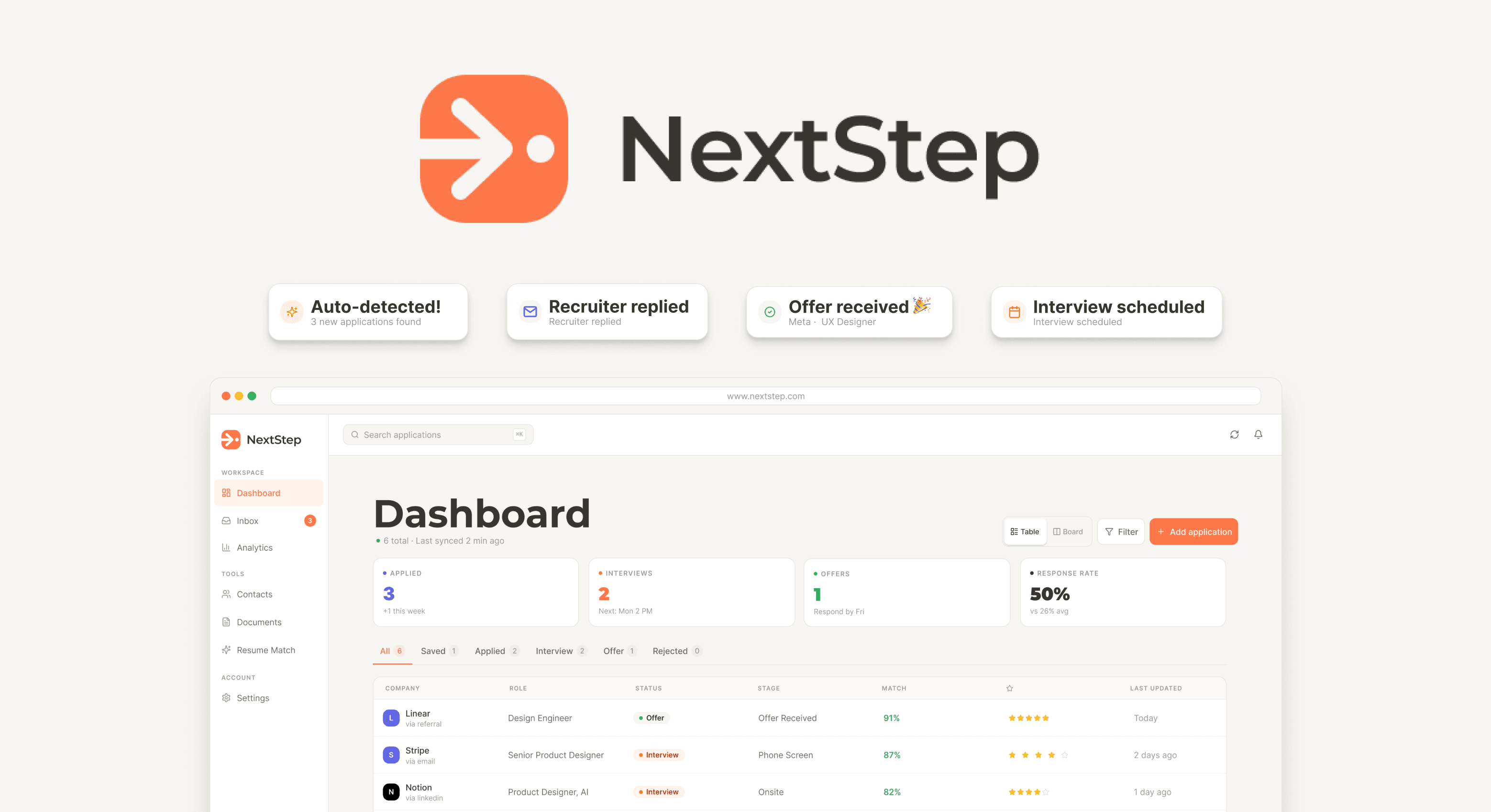
A job tracker that fills itself out. NextStep reads the signals already in your inbox and keeps your applications, contacts, and follow-ups up to date — so you stop losing opportunities to a messy spreadsheet.
The Problem: Applying Is Easy. Remembering Is Hard.

A typical search runs [3–6] months and [50+] applications. People manage it with a spreadsheet, a dozen tabs, and a mental note to follow up. The spreadsheet goes stale in week two, and a recruiter's email sits unanswered between two newsletters.
Here's the thing: all that information is already in their inbox — confirmations, recruiter replies, interview invites. People are just expected to copy it into a spreadsheet by hand, during one of the most stressful periods of their life.
So I reframed it: this is a tracking and memory problem, not a job-board problem. My goal was to cut manual upkeep to near zero and give people one view of their search they could trust.
Research: Talking to People Mid-Search
I interviewed [X] active job hunters — recent grads, career switchers, laid-off folks — and asked them to walk me through their real tracking setup. Three things kept coming up:
01 — Everyone starts a spreadsheet. Almost nobody maintains one. The upkeep costs more energy than it returns.
02 — The scariest moment isn’t rejection, it’s silence. People couldn’t tell “they haven’t replied” from “I forgot to follow up.”
03 — Nobody trusts automation they can’t see. Auto-tracking from email got interest plus suspicion. People wanted to confirm what the system found.
That last finding shaped the product most: automation had to show its work.
Who I Was Designing For
Two personas came out of the interviews, pulling the design in different directions:
Meg , 25
The Volume Applicant
[Early career, 20+ applications a week]
Needs: speed, zero-friction capture
Pain: can't remember which resume went where
Mario, 22
The Careful Switcher
[Employed, applying selectively]
Needs: reminders, context on each contact before a call
Pain: the search competes with a day job, so things go stale

Mapping the Journey Before Drawing Screens
Before any UI, I mapped the full search journey

Those leak points became the core flows.
Four Rules I Held Every Screen To
01 — Clarity over cleverness. Every screen has to earn its place.
02 — One place for everything. Status, contacts, and next steps live together.

03 — Kill the busywork. Automate the data entry people dread, but let them confirm it.

04 — Built to scale. Components and variables, never one-off layouts.
Building the Foundation First
I set up the design system before the product: a focused palette, a small type ramp, and semantically named Figma variables. A later rebrand became one variable update instead of fifty layer edits.

The Landing Page: One Job, One Promise
The landing page had one job — explain a new concept fast enough to earn a sign-up. I led with the promise ("Never lose track of your job applications"), showed the workflow, then drove to a single call to action. Value, proof, ask.

Iterating: first version agains the final version
I tested v1 against the four rules and against [usability tests / feedback from 10 people by using a form ], then rebuilt what didn't hold up:

From Figma to Working Code
I carried the system into a coded build — type, color, and components mapped straight from Figma variables. The prototype behaves like a real product, and design and code never drifted apart.


What I’d carry into the next project
Design variables are a force multiplier: Semantic naming up front makes every brand evolution cheaper and faster.
Visual consistency comes from constraints, not restrictions: A tight palette and small type scale remove small decisions so meaningful ones get more attention.
Copy is designed: The biggest landing page improvement came from rewriting one headline.
Transparency builds trust: Showing users what the system detected and letting them approve it turns automation from scary to useful.