

<!--
Work info
-->
School Project
UX/UI Designer

<!--
Overview
-->
A ground-up rethink of how people browse, start, and finish a workout — turning a cluttered, drop-off-prone flow into a focused, motivating, three-tap experience.
<!--
01 — The Problem
-->
What adidas Training is
adidas Training is a mobile fitness app that lets people run guided bodyweight and equipment workouts, follow structured plans, and track their progress over time — no gym required.
Browse & filter
Find a workout by goal, body part, duration, and difficulty without endless scrolling.
Guided sessions
A live, timed workout player with a countdown ring, pause/resume, and clear step cues.
Progress & rewards
Weekly activity charts, streaks, achievement badges, and a profile that tracks goals.
The redesign focused on the core loop most users do every day: browse → start → complete a workout, plus the motivational layer (progress and achievements) that brings them back.
<!--
02 — The Problem Statement
-->
Great workouts, lost in friction
Users wanted to just start moving , but the existing flow buried workouts behind too many taps, offered weak in-session feedback, and gave little reason to come back. The result: high drop-off before the first rep and low repeat engagement.
Too many taps to start
Reaching an active workout took 6+ taps through nested menus, killing momentum.
Weak in-session feedback
The timer was small and static — users lost track of time remaining and felt unmotivated mid-set.
No reason to return
Progress and achievements were hidden, so finishing a workout felt like a dead end.
How might we help everyday athletes go from open-app to first-rep in seconds — and feel motivated to come back tomorrow?
<!--
03 — Business Goal
-->
Every design decision laddered up to measurable goals that matter to adidas as a business and a brand.
increase workout completion rate
Get more users from "browsing" to "finished" by removing friction in the core loop.
Improve 30-day retention
Build a motivational layer (streaks, badges, progress) that gives users a reason to return.
Strengthen brand fit
Make the experience feel unmistakably adidas — bold, confident, performance-driven.
Support premium conversion
Showcase the value of guided plans to nudge free users toward adidas Training Premium.
<!--
04 —Competitor Analysis
-->
I audited four leading fitness apps to find table-stakes patterns and gaps adidas could own.

The clear white space: fastest path to a great no-equipment workout, wrapped in adidas's bold, motivating brand — without the bloat of class libraries or hardware lock-in.
<!--
05 — User persona
-->
Who I designed for
Synthesised from interviews and survey data into two primary personas.
Maya, 29
Goals: Squeeze in a 20-minute workout between work and life. Wants zero setup friction.
Frustrations: Apps that make her dig through menus before she can move. Loses motivation when she has to decide.
"If I can't start in under a minute, I just don't bother."

Devon, 34
Goals: Build a sustainable habit and see progress over weeks, not just one session.
Frustrations: Finishing a workout feels anticlimactic. Nothing celebrates the win or pulls him back tomorrow.
"I want proof I'm getting better. Otherwise, what's the point?"

<!--
06 —User Interviews & User Surveys
-->
6 moderated interviews + a 52-person survey of people who work out at home at least twice a week.
Theme 1 -Speed
"Just let me start" was the most repeated phrase. Decision fatigue was the enemy.
Theme 2 -Presence
Users wanted a big, glanceable timer they could read mid-rep from across the room.
Theme 3 -Reward
The finish moment needed to feel earned — a celebration, then a clear nudge forward.
<!--
07 — Sketches & Low-Fidelity Wireframes
-->
Before any pixels, I sketched and built grayscale wireframes to validate layout and flow.

Key decision validated here: make the "Start Workout" action the visual anchor of the home screen, and give the active workout an oversized timer + large tap targets (Pause/Finish) so users never hunt for controls mid-set.
<!--
08 — Usability Testing Results
-->
Before
The plan
Participants: 8 home-workout users (mix of both personas)
Method: Moderated task-based sessions, think-aloud
Tasks: Find a 20-min core workout, start it, pause, finish, and check weekly progress
Metrics: Task success, time-on-task, taps-to-start, SUS score
After
The results
100% completed the start-a-workout task unaided (was 62% on the old flow)
SUS score: 86
2 users wanted a "skip rest" control — added in iteration
1 confused by filter chip states — increased active-state contrast
Fix 1
Boosted contrast on active filter chips so selected state reads instantly.
Fix 2
Added a "skip rest" tap target between sets for advanced users.
Fix 3
Enlarged the completion CTA and added confetti for a satisfying finish.
<!--
09 —High-Fidelity Mockup
-->
Bold adidas black-and-white, Inter type, oversized controls, and a glanceable progress ring at the heart of the workout. These are true-to-design renders of the actual screens from my prototype.
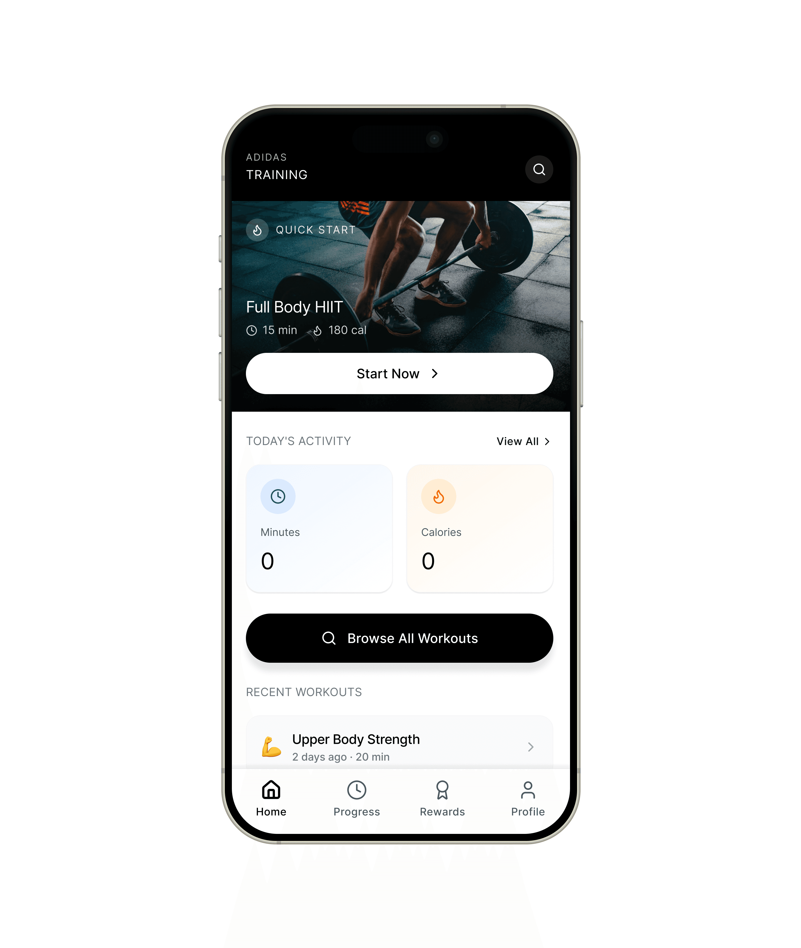


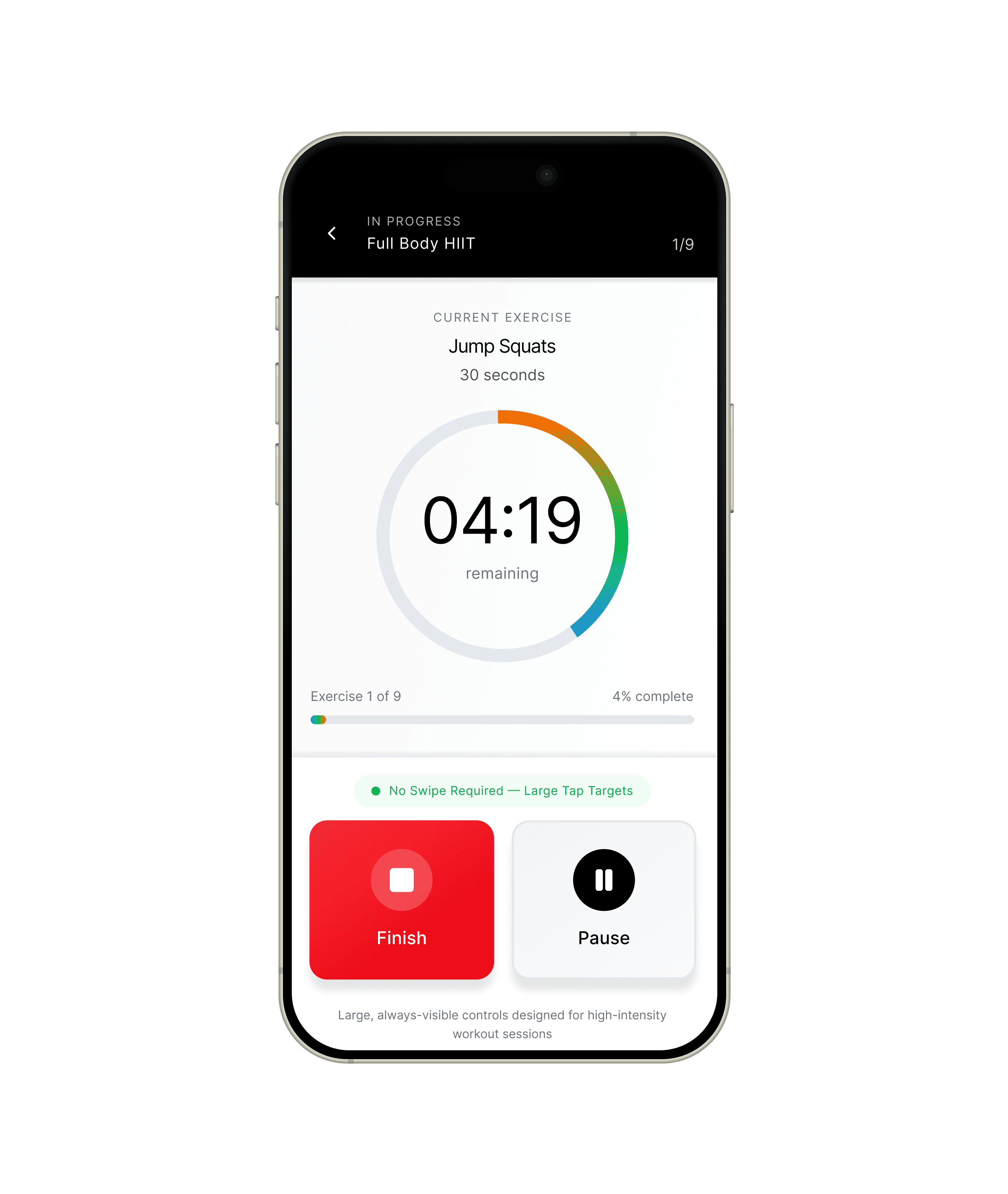

The full system also includes Progress (weekly activity bar charts and stat cards), Achievements (badge grid and leaderboard), and Profile (goals tracking) — all sharing the same black header, bottom-nav, and card language shown above.
<!--
10 — Project metrics and Impact
-->
Measured against the goals
Results from prototype usability testing, compared to the existing experience.
<!--
11 — What I Took Away
-->
What I'd carry forward
Speed is a feature:
Removing taps had a bigger impact on motivation than any single visual choice. Friction is where intent dies.
Feedback fuels follow-through
A glanceable timer and a celebratory finish did more for perceived value than extra content ever could.
Test earlier than feels comfortable
Paper testing in week 3 caught a filter-discoverability issue before I'd invested in high-fidelity.
Build it to feel it
Prototyping in real code surfaced timing and state nuances that static mockups completely hid.